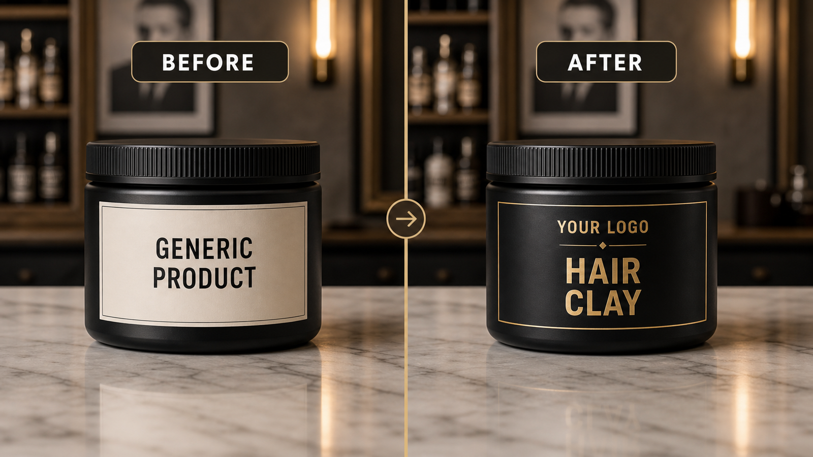
Start with hierarchy
The logo, product name, and main use should be easy to read. If clients cannot understand the label quickly, the design is too busy.
Design for the shelf, not only the screen
A label may look good on a phone but still be hard to read on a jar. Think about real shelf distance.
Use mockups before production
A mockup helps you catch spacing, contrast, and brand issues before the label is printed.
Quick FAQ
Do I need a designer?
A designer helps, but a clean logo and simple direction can be enough to start.
What makes a label look premium?
Clear spacing, readable text, and controlled color choices usually matter more than decoration.